Author
Jun Wang writes about product management, product design, and how design thinking applies to commercial outcomes. She has worked at the intersection of user experience and business conversion across education and enterprise products.
Product & UX strategy
Writing
In 2018, I was an interaction designer on the Online product line at 17EdTech (一起作业), one of China's largest K-12 homework platforms. The team was running commercial experiments on a student-facing product. I joined three of them — Expert Explanation (名师点拨), Smart Hint (智能提示), and Q&A Tutoring (错题答疑) — each with a pre-defined conversion target, each validated with real users, and each eventually taken offline when regulation prohibited charging students directly.
The common assumption is that commercial work belongs to the PM and designers just make it look good. I do not agree. Design decisions are commercial decisions.
Jun Wang writes about product management, product design, and how design thinking applies to commercial outcomes. She has worked at the intersection of user experience and business conversion across education and enterprise products.
Most design work starts with a question about form: what should this look like, where should it go, how should it behave? Commercial design needs to start one step earlier: what does success actually look like, and how will we know if the design is getting there?
Without a pre-defined target, a designer has no basis for choosing between options. Everything becomes a matter of taste or internal debate. With a target, every decision can be evaluated against a shared question: does this help reach the number?
For each of these three features, quantitative targets were defined before any wireframes were drawn:
These numbers reframed the design problem. The question was no longer "where should this feature go?" It became: "at what moment, and in what form, does a user go from seeing this entry to actually deciding to pay?" That is a much harder and more interesting question to design for.
Commercial timing is not a placement decision. It is a psychology problem. The question is not "which page should we put this on?" The question is "at what moment is this user's willingness to pay at its highest — and what is happening in their mind at that moment?"
To answer that, we did something that standard feature work often skips: we systematically observed user behaviour and emotional state across different points in the product flow. Not "would you pay for a tutoring feature?" — a question that produces socially polished answers — but something more specific: where in the experience does the need to understand feel most urgent? What does the user feel when they are at that point?
The finding was: the wrong-answer report page is that moment.
When a student has just finished their homework, seen which questions they got wrong, looked at the correct answer and still does not understand it, they are in a state of cognitive gap — they know they do not understand, but cannot quite say where the confusion is. This state has three important characteristics:
In contrast, showing a commercial entry on the home screen or right after a correct answer produces none of these conditions. There is no urgency, no specific need, and the cognitive friction is higher. Timing is wrong, so even good design will not get conversion.
The entry point placement was not a product preference. It was a precise response to the user's psychological state.
This research conclusion directly determined the placement rule for all three features: not on the home screen, not after a correct answer — only on the report page and question-analysis page that follow a wrong answer.
The research also surfaced a second key finding: the main source of payment friction is not "the price is too high." It is uncertainty — users do not know whether the feature is worth paying for, do not know the quality, and worry about being disappointed with no easy way to get a refund.
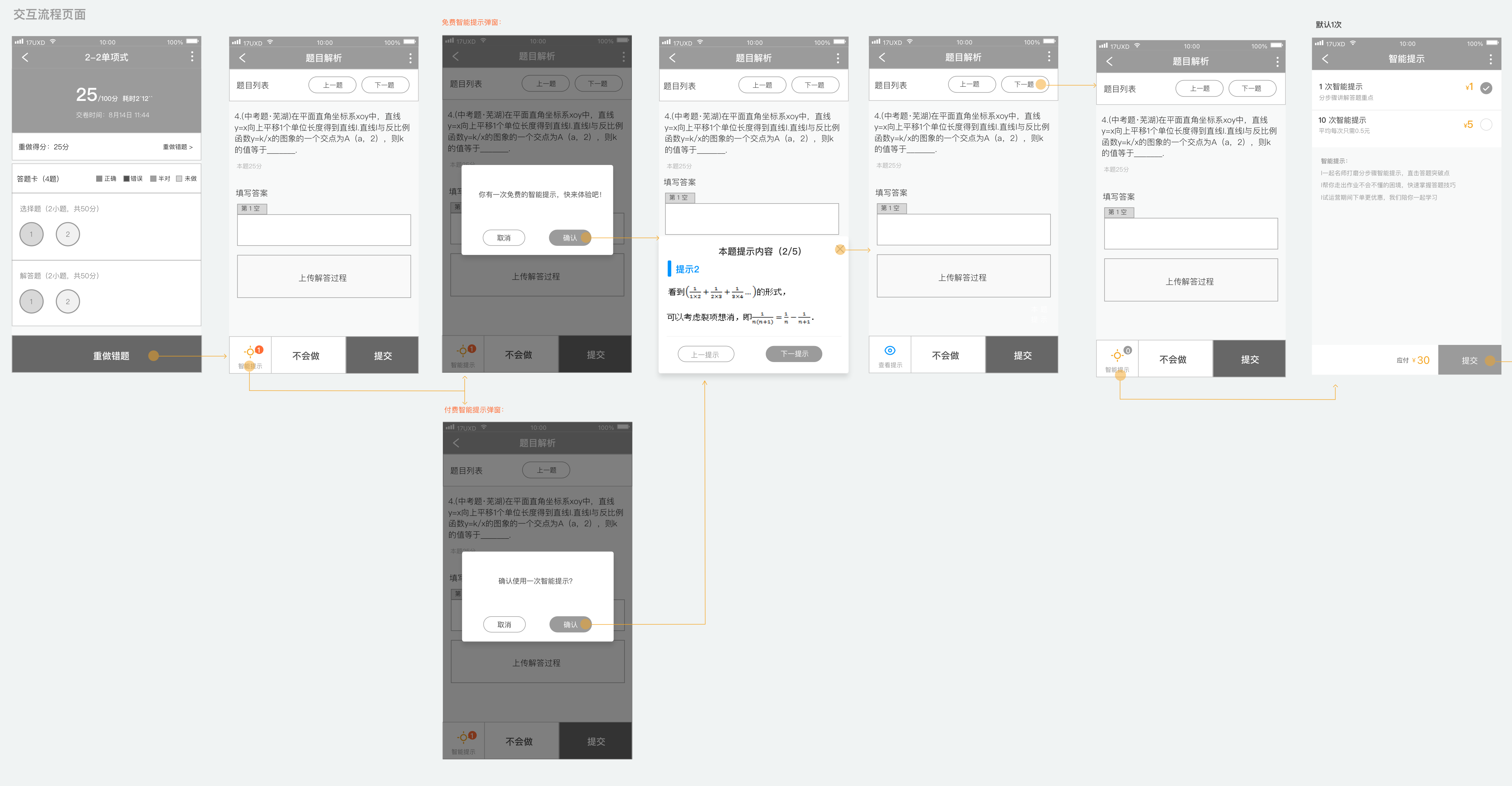
This insight directly shaped the Smart Hint "first use free" design. Free first use is not only a pricing strategy. It is a trust-building strategy: let the user experience the value with zero risk first, then make the payment decision. That sequence — experience before payment — is the core logic behind reducing payment friction.
Each extra step between a user seeing a commercial entry and completing payment is not just an inconvenience. It is an active conversion penalty. At each step, the user must make a fresh micro-decision: do I still want to continue? The emotional window around a purchase intention is narrow. Every additional tap gives the user a chance to reconsider, get distracted, or simply lose momentum.
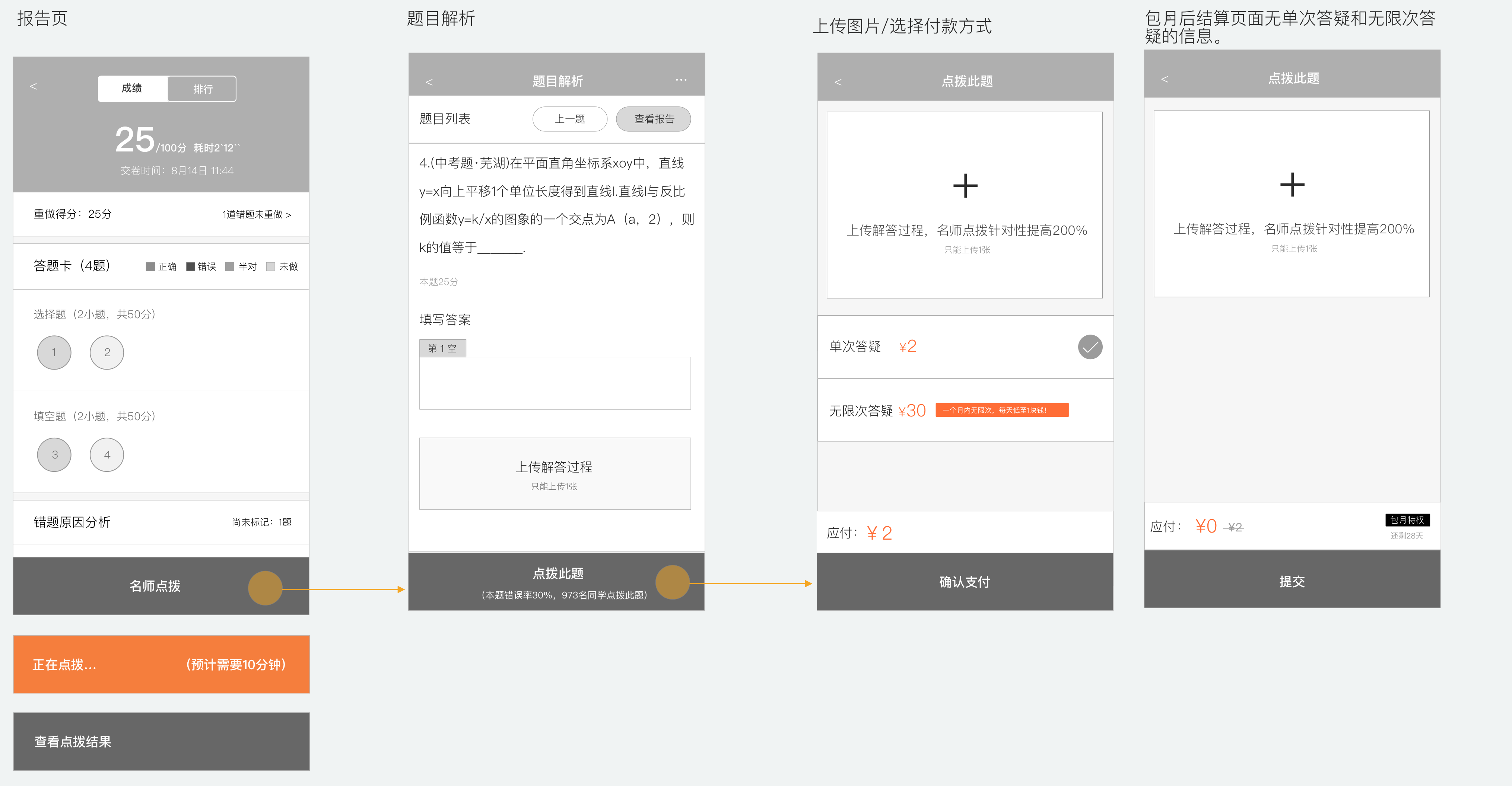
This is why flow length consistently had more impact on conversion than any visual change we made. The Expert Explanation redesign is the most direct proof.
The original path was:
Report page → Answer sheet (select wrong question) → Question analysis → Request explanation → Pay
The answer-sheet step seemed reasonable in isolation: let users choose which question they want explained. But the commercial problem was the timing. This step appeared at exactly the moment when the user's motivation to convert was highest — right after seeing their wrong results. Instead of channelling that motivation toward payment, it interrupted it with a new task requiring thought and selection. By the time the user reached the payment screen, the emotional peak had already passed.
The redesign removed the answer-sheet step entirely:
Report page → Request explanation (enters wrong question directly) → Pay
At the same time, two conversion triggers were added to the question-analysis page: this question's error rate and number of students who requested an explanation — "30% of students got this wrong. 973 students have requested an explanation." These two numbers address the two biggest purchase hesitations simultaneously: the question really is hard (your confusion is legitimate), and other students have already decided it was worth paying for (the decision is validated).
One step removed. Two purchase hesitations answered. The conversion window was protected instead of interrupted.
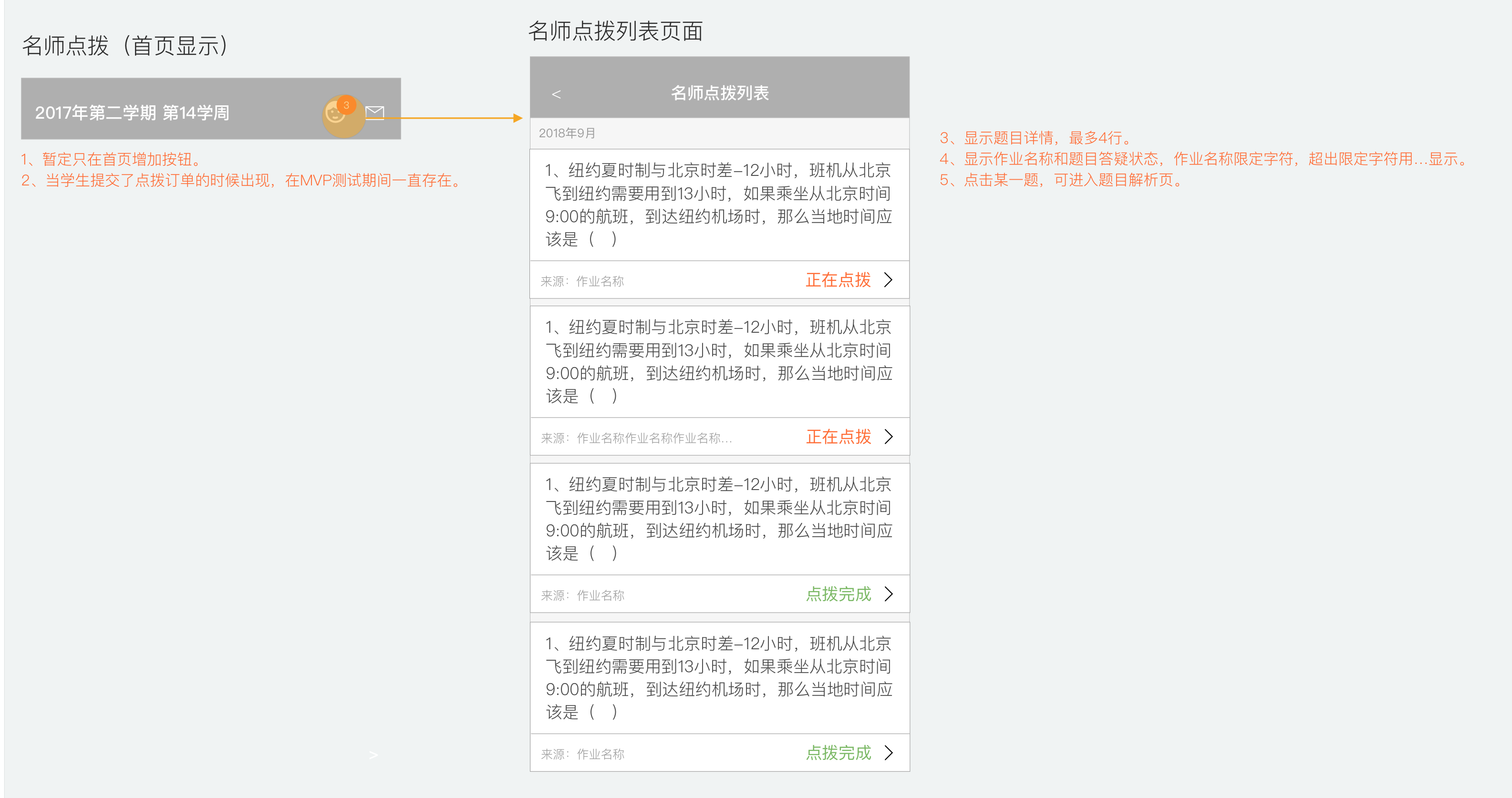
The path to view past records was treated the same way. The original path required going through "Home → Assignment history → Report → Answer sheet → Question analysis → Explanation page" — extremely deep. The new design added a shortcut icon on the home screen that goes directly to the Expert Explanation history list, where each question shows its status clearly: in progress or complete.
Users who can more easily revisit content they paid for are more likely to feel the purchase was worth it, and more likely to renew.
When a user who has already paid sees a purchase prompt, they think one of two things: either the product does not know they have paid, or it is trying to charge them again. Both interpretations damage confidence. A commercial feature that erodes trust after purchase makes renewal less likely — the harm is delayed, but it is real and measurable in retention rates.
The opposite failure is equally costly. A user who has paid, whose session has started, but who cannot easily find the entry point will assume the feature is broken or that their money was wasted. Both failure modes hurt the commercial outcome: one before payment, one after.
This is the commercial problem that state design actually solves. It is not a UX nicety. It is about making sure each user receives exactly the signal that matches their situation — so that trust is maintained, and willingness to re-purchase is preserved.
The Q&A Tutoring feature handled this with the most detailed state breakdown. The floating bubble on the question page shows how differently each state needs to be handled:
| User state | Bubble behaviour |
|---|---|
| Not purchased | No bubble; fixed button on report page drives purchase |
| Purchased, tutoring time not started | No bubble (avoids users tapping and finding nothing) |
| Purchased, within tutoring window | Green bubble with remaining-time countdown |
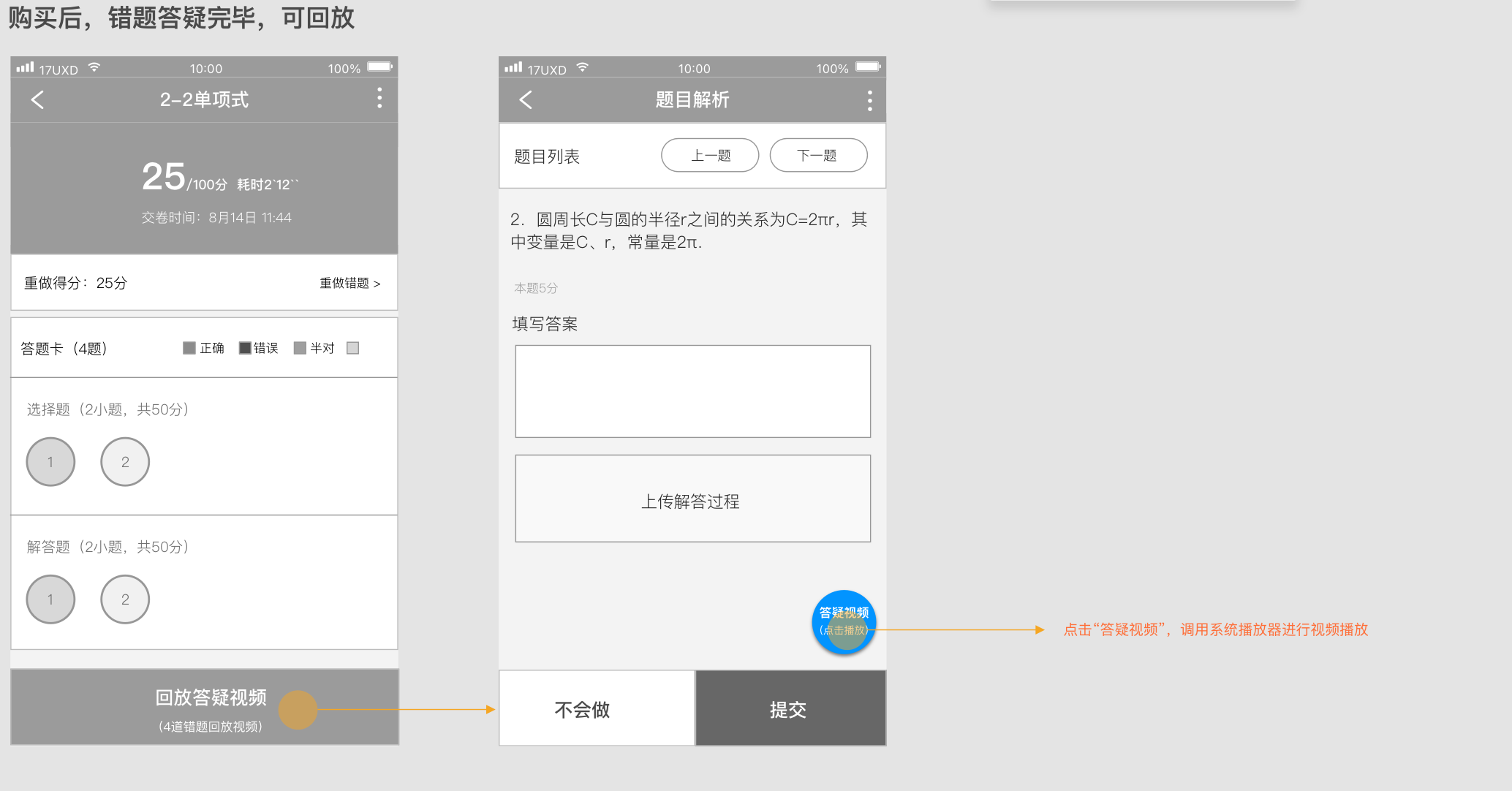
| Session ended, replay available | Blue bubble: "Tutoring video (tap to play)" |
The logic behind this state design is: at each state, there is one thing the user most needs to know. Tell them only that one thing. A user who has paid but the session has not started does not need to see a purchase prompt again. A user whose session is live needs an immediate action entry. A user whose session is over needs a replay and renewal prompt.
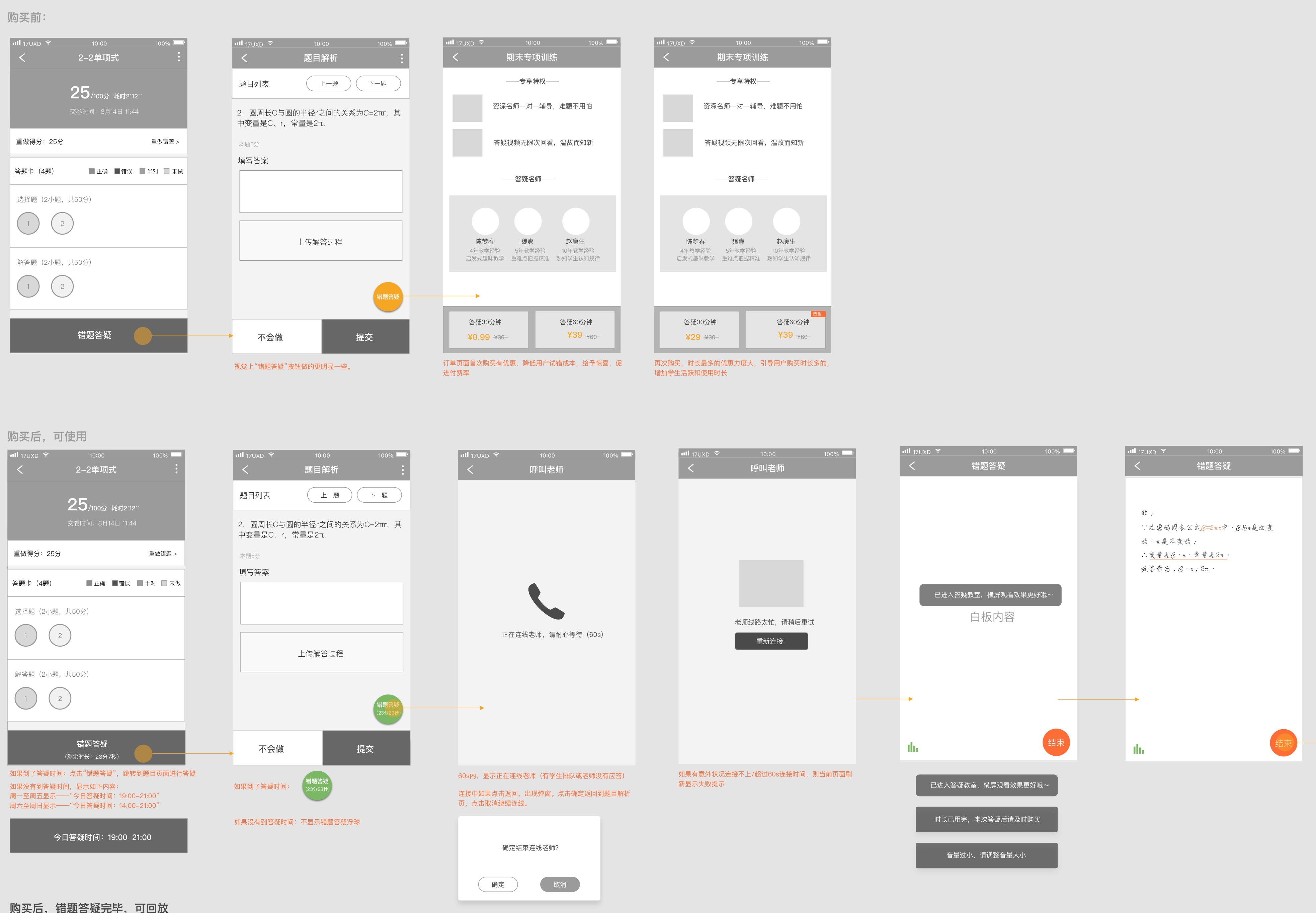
The choice to use a floating bubble was itself a decision — not a purely visual one, but one that considered implementation cost. A floating bubble on the question page can be added or removed by engineering without changing the main page structure. This made the feature's release and rollback costs much lower, fitting the "ship fast, validate fast" rhythm of an MVP stage.
After the session ends, the bubble turns into a blue replay entry that calls the system player to play the teacher's tutoring recording directly:
The Smart Hint feature also used state differentiation, focused on modal copy and experience differences:
The same modal format, but in different contexts with different copy, sends a completely different signal. Hint content was shown as step-by-step cards (five steps total), not giving the answer directly, only showing the direction for solving the problem. This design choice determined whether the effective-rate metric was achievable, because a hint that was useless would not improve correct-answer rates.
A pricing page is not a list of options you put in front of the user and wait. It is a decision architecture. Your job as a designer is to make the choice that is commercially optimal also feel like the obviously right choice for the user — without pressure, and without cognitive overload.
The key insight is that a first-time buyer and a returning buyer are in completely different psychological situations, and they need to be led to completely different decisions. A first-time buyer needs to believe the risk of trying is near zero. A returning buyer, who already knows the product works, needs to be guided toward higher value. One pricing structure cannot serve both goals equally well.
The Q&A Tutoring pricing page used two separate structures depending on purchase history:
First purchase:
Re-purchase:
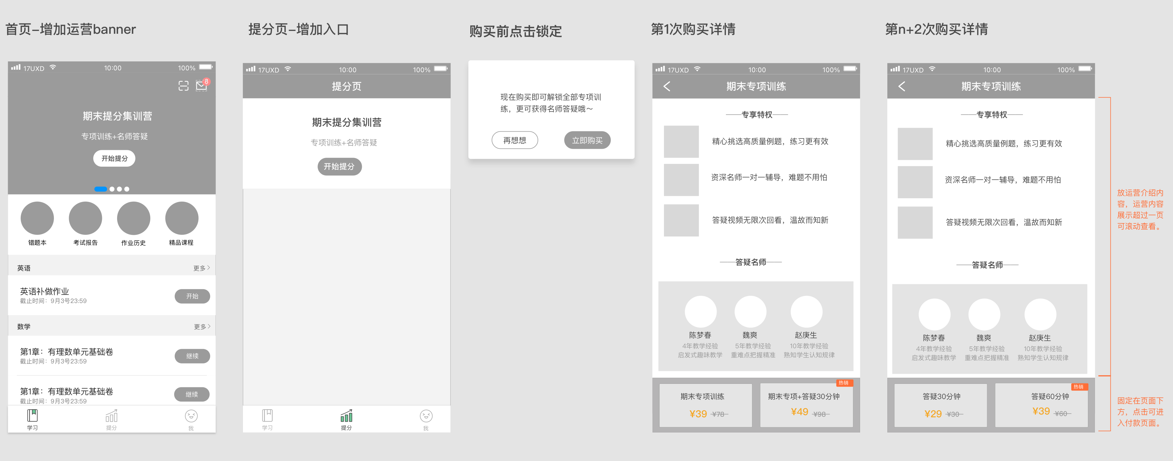
This pricing logic has a clear commercial intent: the first-purchase goal is conversion, using a near-free price to remove the fear of trying; the re-purchase goal is higher order value and longer sessions, using a price gap to guide users to naturally choose the more expensive option.
What design does here is not decide the pricing strategy — that is a product and business decision. What design does is express that strategy accurately in the interface: which option goes on the left, which on the right, which gets the "bestseller" label, which shows a crossed-out original price. These visual-level choices directly affect how users allocate attention and make decisions.
The same product, the same price, and the same interface can produce very different conversion rates depending on what the user was doing and feeling before they saw the offer. Mental state is not a soft consideration. It is a variable that changes the commercial logic of the entire design.
A user who just got a question wrong has a specific, immediate need. Their motivation to resolve it is high, and their tolerance for friction is low: they want help now. A user who is planning their study session has a different kind of motivation — more diffuse, more rational, more about expected value over time. These two users are not the same buyer. Designing one entry for both is likely to be suboptimal for both.
This is why Q&A Tutoring validated willingness to pay separately in two distinct scenarios:
Understand the user's mental state at this moment first. Then decide what form the commercial entry should take.
The point of validating these two scenarios separately was not to produce two different designs for their own sake. It was to identify which context produced stronger purchase intent and smoother conversion, so that future investment could go to the place where the commercial logic was actually strongest. That is how a designer thinks about commercial efficiency — not just "does this look right?" but "where is the leverage?"
The project decisions described above are not the real point of this article. They are evidence for a set of principles that apply well beyond this particular product. Here is what they distill to.
1. Timing matters more than form
When a commercial entry appears matters much more than what it looks like. The same button placed when a user gets a question right versus when a user gets a question wrong produces completely different conversion results — not because the button changed, but because the user's mental state changed. The core question is: does this appear at the moment when the user's need is strongest? That judgment comes before any other design decision.
2. Commercial entries must not break the main task
Users came to do their homework. They did not come to be sold to. A commercial entry must appear without interrupting the primary task. This is why Q&A Tutoring used a floating bubble instead of a blocking modal. The bubble exists in the user's visual field but does not force them to stop and make a choice. A blocking modal forces an interruption even when the user has no interest in paying. Short-term conversion numbers might look better, but the damage to the experience — and to renewal rates — is long-term.
3. Reduce decision cost, not increase options
The purpose of a pricing page is not to show every available price. It is to help users quickly make a choice they will not regret. The heavy first-purchase discount and the second-purchase price-gap nudge both follow the same logic: guide the user to the most reasonable choice for them using the least possible cognitive effort. More options and more complex pricing means higher decision cost and a higher rate of abandonment.
4. Social proof must be directly relevant to the user's current situation
"973 students have requested an explanation for this question" and "30% of students got this wrong" address two psychological barriers at once:
This is precise use of social proof: not a vague "users love it" label, but data that is directly tied to the user's current situation. The more relevant the connection, the stronger the persuasion.
5. The first experience determines long-term willingness to pay
The long-term health of a commercial feature depends on whether the first experience actually delivers value. If the Smart Hint content was useless, the free first use would not drive paid conversion — it would make the user more firmly committed to never paying.
This is why the "effective rate" (correct after seeing the hint ≥ 50%) was included in the success criteria from the start. It was not just a metric. It was a design constraint: the hint content must genuinely help, because if it does not, the entire commercial loop is broken from the inside.
After these three features went live, the data came back within target range. The Expert Explanation flow optimisation improved conversion-path efficiency. The Smart Hint's free first experience successfully drove follow-on payment. The Q&A Tutoring first-purchase discount successfully reduced the barrier to trying.
Then all three were taken offline.
The reason was policy: regulations clearly stated that education software for underage students could not collect payment directly from students. The entire commercial direction was cut — not because the product did not work, but because it ran into an external constraint that had not been properly evaluated at the inception stage.
What this left me with was not the conclusion that "commercial features cannot be done." It was a more specific understanding: in a heavily regulated industry, policy compliance should be an early design input, not a surprise encountered at launch. If the constraint "policy risk of charging minors directly" had been included in the requirements-definition phase, the entire commercial path might have taken a completely different direction — such as a bundle sold to parents, or a B2B procurement model through schools.
The product design work validated that these commercial directions worked at the user-experience and conversion-logic level. That conclusion was not overturned by the policy. The policy only rejected "charging students directly." It did not reject the finding that "users are willing to pay to understand a question."
Design has real leverage in commercial work. But it also has a hard boundary. Conflating the two — either overestimating what design can fix, or underestimating what it controls — leads to wasted effort and misplaced blame. Here is the honest version.
What design can do:
What design cannot do:
This boundary is not a limit on what a designer can do. It is the right position for design in the product decision chain: design is responsible for taking something that has already been judged worth doing, and expressing it as effectively as possible. Getting this position right is what allows a designer to truly contribute to a commercial project — and to avoid putting effort in the wrong direction.