I founded ASA after noticing a specific gap: Australia already has mental health and community resources for multicultural populations, but for many people from Asian backgrounds, language, cultural context, and how those services are structured still create real distance from the support that exists. What started as a community response quickly became a product problem: the organisation needed more than a public website. It needed a bilingual, trust-building platform that could support content, events, membership, courses, and internal operations. I defined the product structure, system boundaries, and delivery priorities, then used AI as a practical execution partner to build the organisation's digital infrastructure from 0 to 1.
Project type
Digital platform with a public-facing service layer and an internal operating layer
Core areas
Non-profit digital infrastructure, mental health education, cultural integration, community operations
My role
ASA Founder — sole resource across product management, UX, UI design, development, testing, and launch. No external developers. AI-assisted coding throughout.
What this proves
I can define the product itself, shape the system structure, and carry the work from problem framing to shipped delivery
Public layer Bilingual trust-building, content, events, membership entry, and community participation
Operating layer Internal management for members, courses, certificates, publications, and event maintenance
Status Live organisation platform built from scratch and designed for later extension
My responsibilities
Defined the product opportunity through user observation, stakeholder interviews across multiple user groups, and organisational needs analysis
Mapped stakeholders and set boundaries between public experience and internal operations
Designed information architecture, user flows, and platform structure across four products
Prioritised first-release scope and defined the roadmap for future expansion
Contributed to brand system development; served as Editor-in-Chief of the ASA Mental Health Review
Delivered all four products end-to-end — PM, UX, UI design, development, testing, and launch — using AI-assisted coding with no external developers
Key challenges
Phased scope decisions. I staged delivery by priority: association intro → event publishing → journal content → course system. Each phase had to work on its own before the next started.
Trust-first design. Users are dealing with mental health challenges. The platform had to communicate mission and non-profit status from the first screen — not buried in an about page.
No engineering team. Four products to ship, no developers. I used AI-assisted coding (Claude, Codex) to build and iterate everything myself.
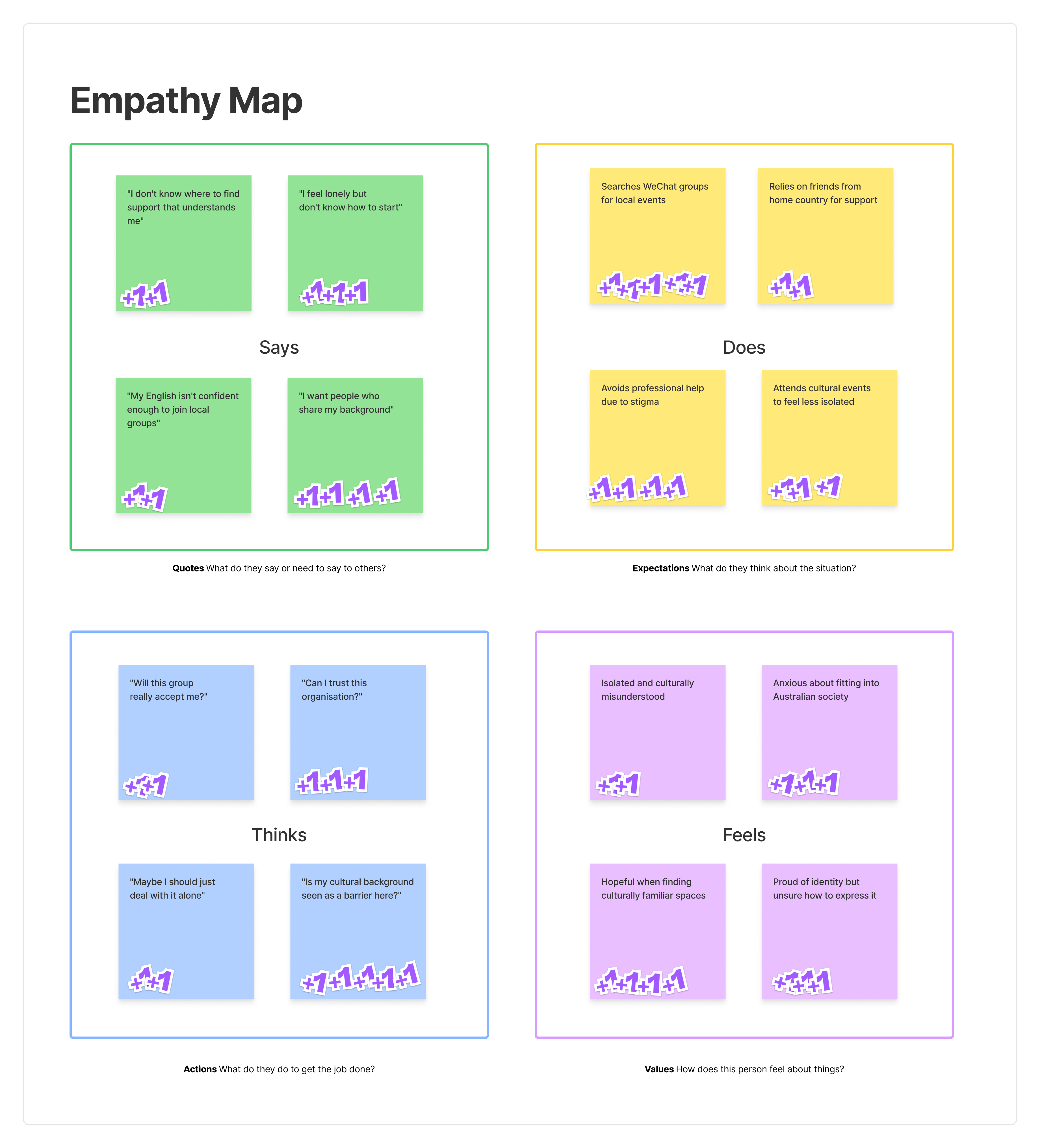
Multi-method user research. One interview round wasn't enough. I ran community observation, one-on-one interviews, empathy mapping, post-release feedback, and member surveys across the project.
Five user types, one system. Participants, volunteers, lecturers, therapists, and operators all had different needs and entry points.
Bilingual from day one. Not an add-on. Trust, content management, and future expansion all depended on it.
System logic had to be right in v1. Account structure, permissions, and cross-surface data relationships are very hard to restructure once the system is live.
Empathy mapping was one of several methods used to surface what users say, do, think, and feel — making hidden needs visible across different user groups.
Product strategy and prioritisation
Priority 1
Define the stakeholders first, then divide the system
I started by mapping who needed what from the platform: public users, volunteers, lecturers, internal operators, and managers. That made it easier to separate trust and participation paths on the front-end from maintenance and operations on the back-end.
Direct user observation and community insight
Early qualitative feedback from volunteers, lecturers, and engaged community participants
Separated public participation paths from internal operations
Information architecture driven by user questions, not by a default website sitemap
Stakeholder mapping helped me define which needs belonged in the public experience and which needed operational support behind the scenes.
Priority 2
Bilingual as a v1 requirement — and an accessibility commitment
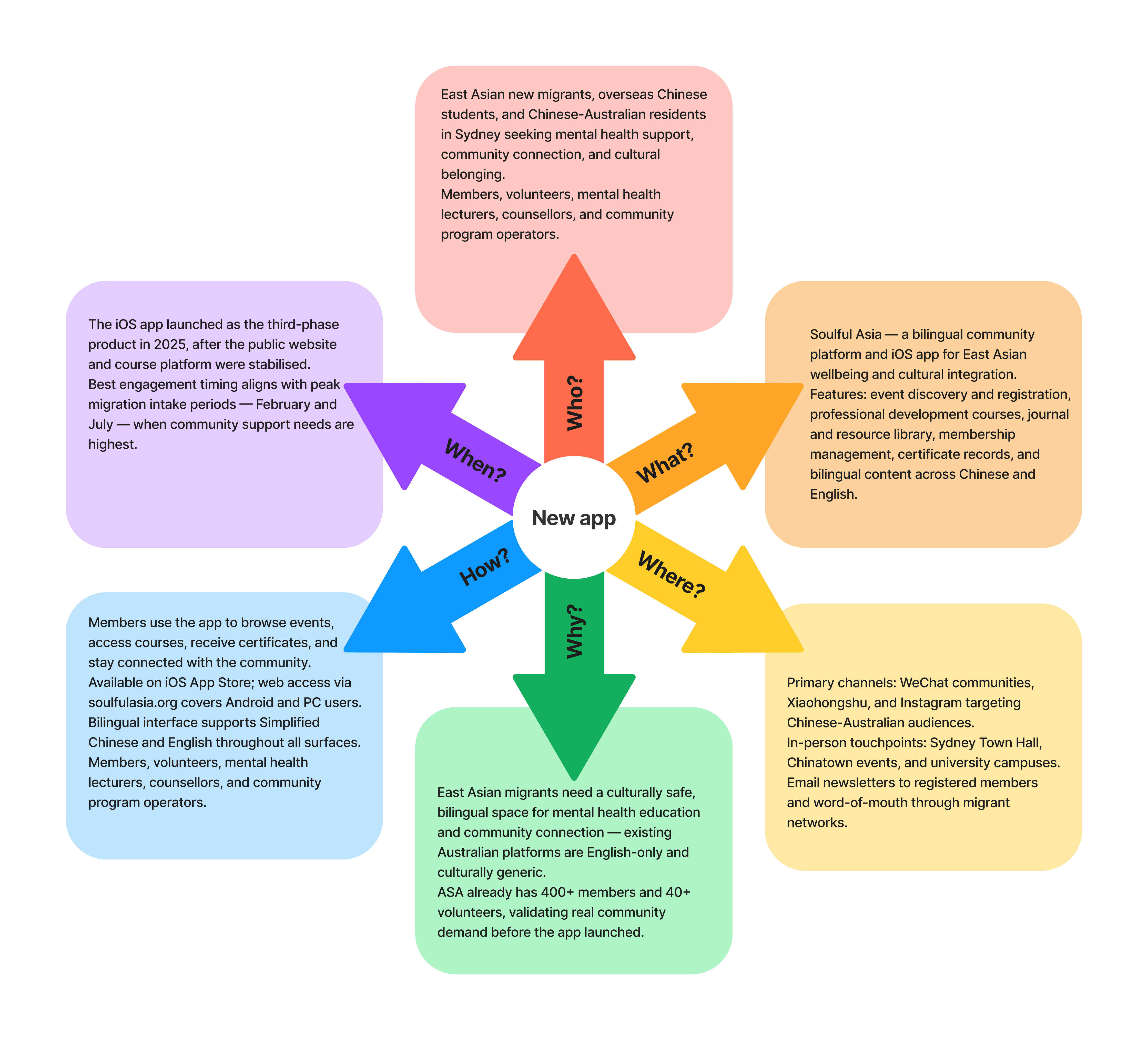
The core user group are overseas Chinese users who need both emotional safety and practical clarity. I treated Chinese and English switching as a day-one product requirement — not a toggle to add later. This decision also directly drove WCAG 2.2 AA compliance: correct html lang declaration, accessible language toggle labelling, and consistent semantic structure across both languages.
html lang — server-side output on first load, client-side sync on switch
Language toggle button — aria-label added, state readable by screen readers
Bilingual design and accessibility compliance were the same workstream, not two separate tasks.
Priority 3
Use the backend to reduce manual operating load
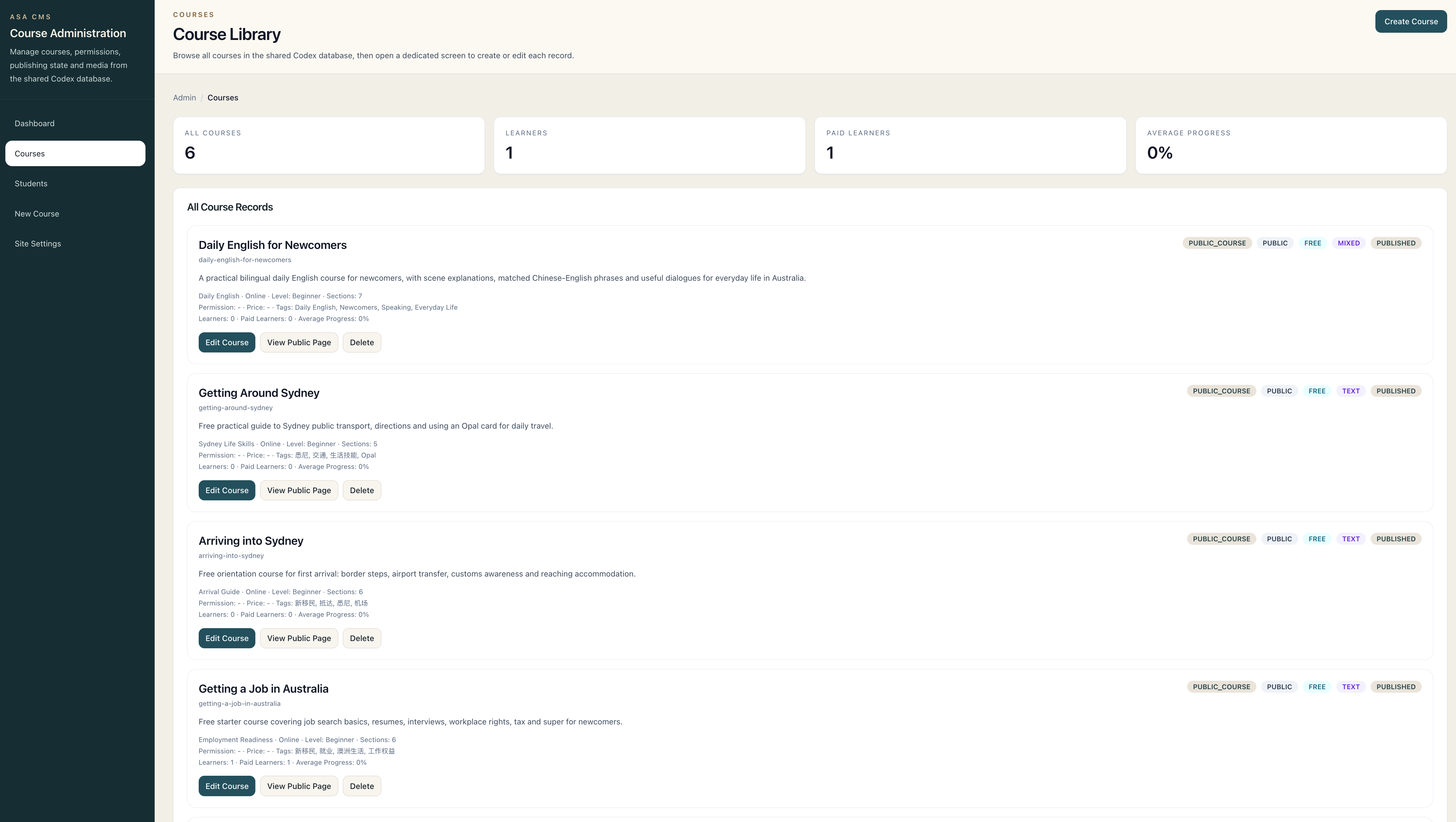
The platform had to help the team run the organisation, not only show it. I defined backend modules around real operating objects such as members, publications, course records, certificates, and event publishing so the system could replace fragmented manual work.
Course records, certificates, and content managed through a unified backend operations platform.
Priority 4
Plan future expansion without overbuilding the first release
I treated the course system as both a current association tool and a potential SaaS direction for future teacher collaboration, while evaluating the app as a lighter-touch member and participation surface. That let me keep the first release focused without losing the longer-term roadmap.
Platform settings kept flexible so the system could expand without rebuilding the first-release foundations.
The first release was prioritised around trust, legibility, and operational continuity rather than around the number of features.
I treated bilingual support and backend structure as initial requirements because both were necessary for adoption and sustainability.
The course system and app direction were deliberately planned as extension paths, not rushed into the first release without a stable system skeleton.
What I did from 0 to 1
01
Problem framing
I framed the work as an organisational digital infrastructure initiative rather than a simple website request.
02
Stakeholder and IA definition
I mapped stakeholders, defined public and operational layers, and built the information architecture around user questions and service logic.
03
Prioritisation
I set the first-release priorities around bilingual trust, core participation paths, backend maintenance capacity, and a stable system skeleton for future growth.
04
AI-assisted execution
I used AI tools to improve implementation speed across product design, coding, debugging, and structured iteration.
05
Validation and launch
I checked whether implementation still matched the original product intent, then drove the work through to a live organisation platform.
How I used AI in practice
What I owned directly
Product architecture and platform structure across all four products
Requirements selection and scope prioritisation for each release
Primary colour system and visual direction for the website
Where Claude and Codex (OpenAI) accelerated execution
UI implementation — translating my layout and colour decisions into working page styles
Frontend and backend code generation, iterated through my review and correction cycles
Database schema drafted by AI, validated and adjusted by me against product requirements
Debugging and deployment steps executed with AI assistance, reviewed and approved at each stage
Project outcome
Unified website
Supports brand communication, events, courses, and content distribution.
Participation paths
Gives visitors clear entry points into public events and community activity.
Content operations
Supports publication and knowledge content under one platform structure.
Operational management
Connects public services to a maintainable internal operations platform.
Platform supports 400+ community members and 40+ active volunteers across ongoing programmes.
Delivered 16 online seminars and 6 in-person events in 2025, including events at Sydney Town Hall and Chinatown.
Backend replaced fragmented manual processes for member management, course records, certificates, and event publishing.
iOS app published to the App Store, extending the platform beyond the website without duplicating the core system.
Built the organisation's full digital infrastructure from 0 to 1 as the sole product, design, and development owner.
Brand system and editorial operation
A trustworthy platform needs a coherent visual identity that a distributed volunteer organisation can apply consistently — without a full-time design team. ASA's brand system was designed by a designer board member, with my involvement in setting requirements, giving direction, and making decisions on how the brand would work across the platform.
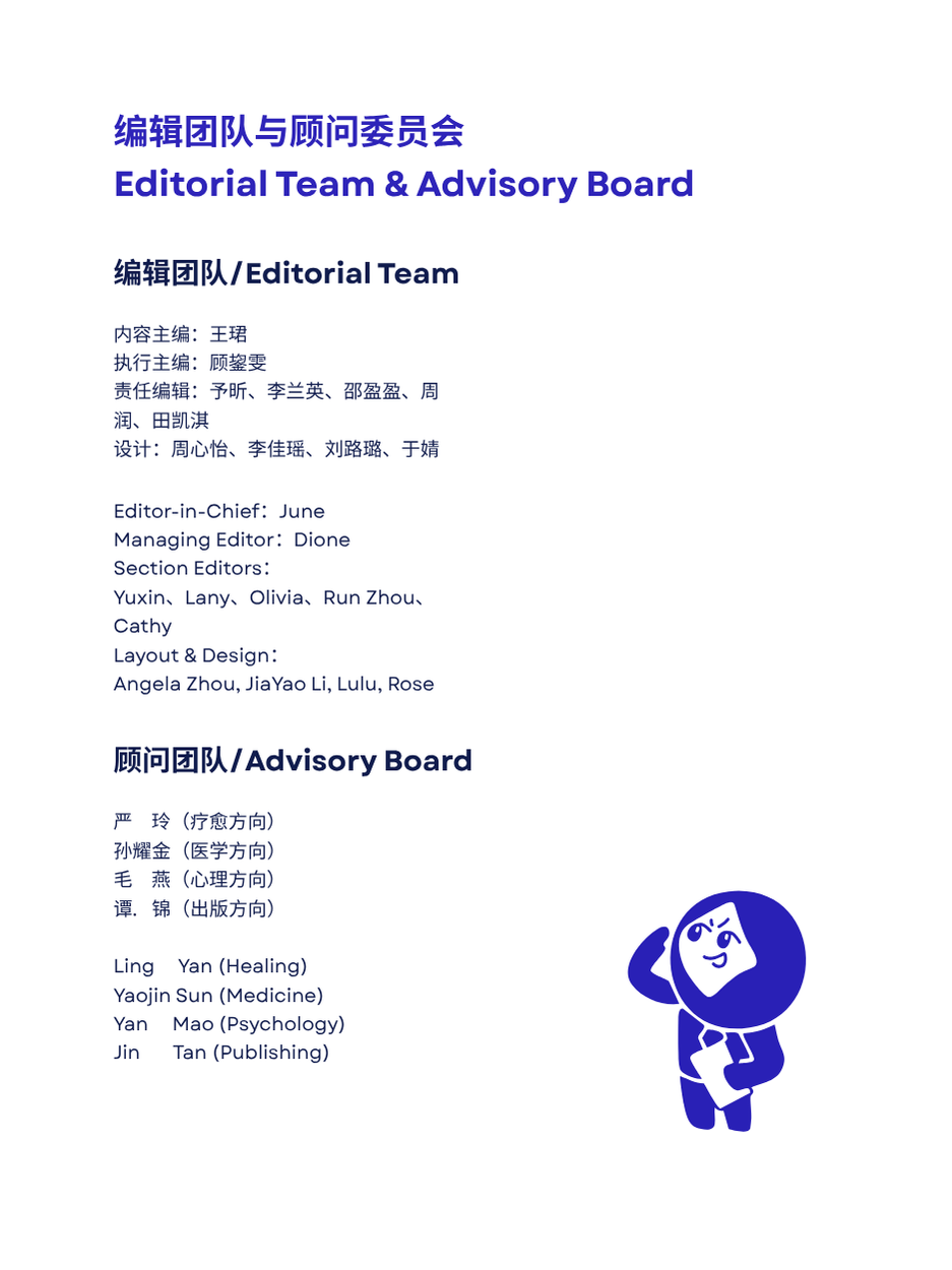
The journal work was different: I served as Editor-in-Chief of the ASA Mental Health Review and was directly involved in the design and editorial output. That involved structuring the operation from scratch — recruiting a managing editor, section editors, layout designers, and a four-person advisory board covering healing, medicine, psychology, and publishing.
The ASA logo uses overlapping coloured bands to represent cultural diversity and connection. The full suite covers horizontal, vertical, and icon-only formats across three colour treatments — used across the website, iOS app, print, and events.
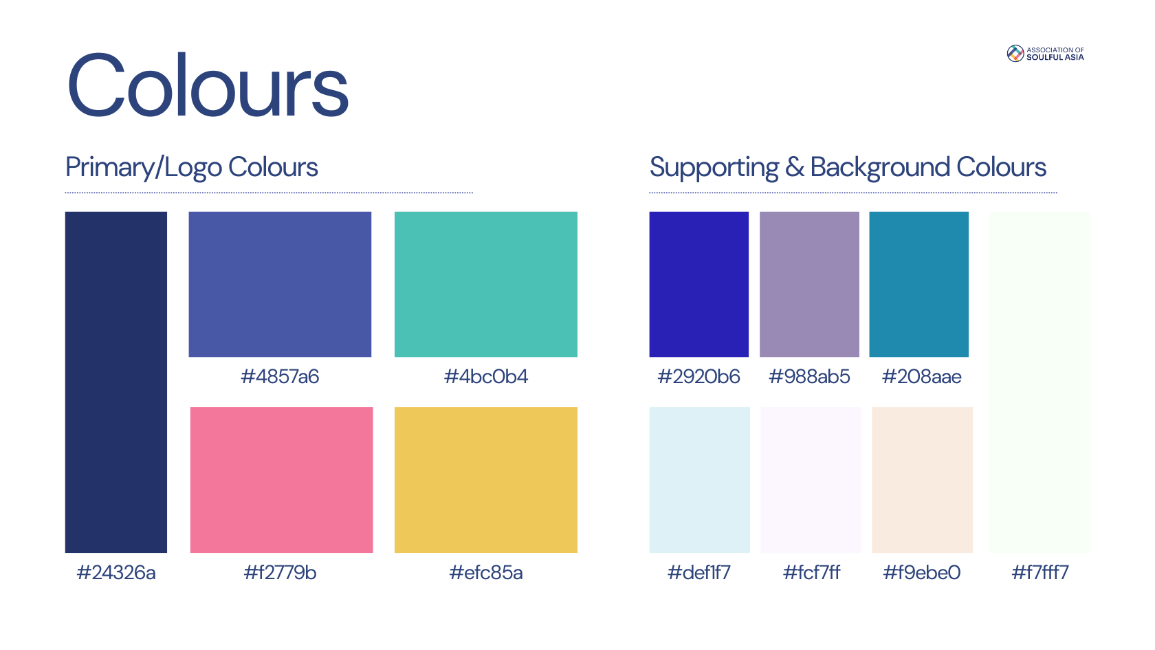
Colour system
Five primary colours and seven supporting tones with defined hex values for consistent use across digital and print.
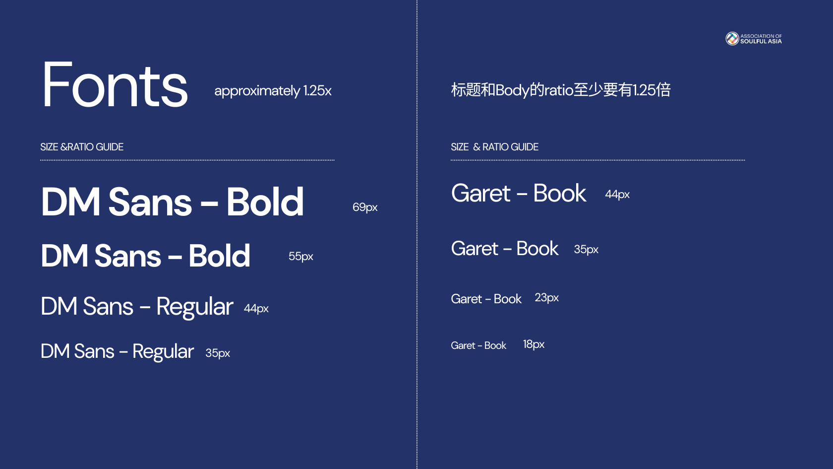
Typography
DM Sans for English; 字由经典黑 for Chinese. Four size levels defined in both languages with a minimum 1.25× heading-to-body ratio.
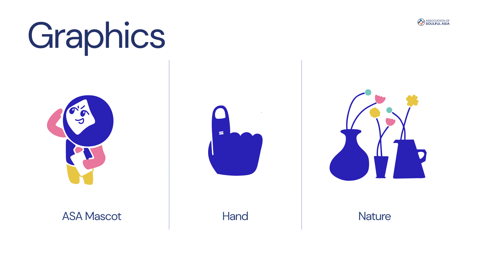
Graphic elements
Mascot, hand, and nature illustration set — a consistent visual language across communications, events, and publications.
Brand Kit
Delivered as a structured Canva Brand Kit so volunteers without design backgrounds could produce consistent materials independently.
Brand and design team
Designer board member: primary creator of the brand system
I set requirements, direction, and decisions on how the brand would function across the platform
4 layout and design volunteers applying the brand system to the journal and communications
Canva Brand Kit as the delivery mechanism for organisation-wide use
Editorial governance
Editorial and ethical statements covering research, anonymisation, and consent standards
Medical and psychological disclaimer defining the journal's scope and limits
Case and privacy policy governing use of personal stories and third-party content
Advisory board covering healing, medicine, psychology, and publishing directions
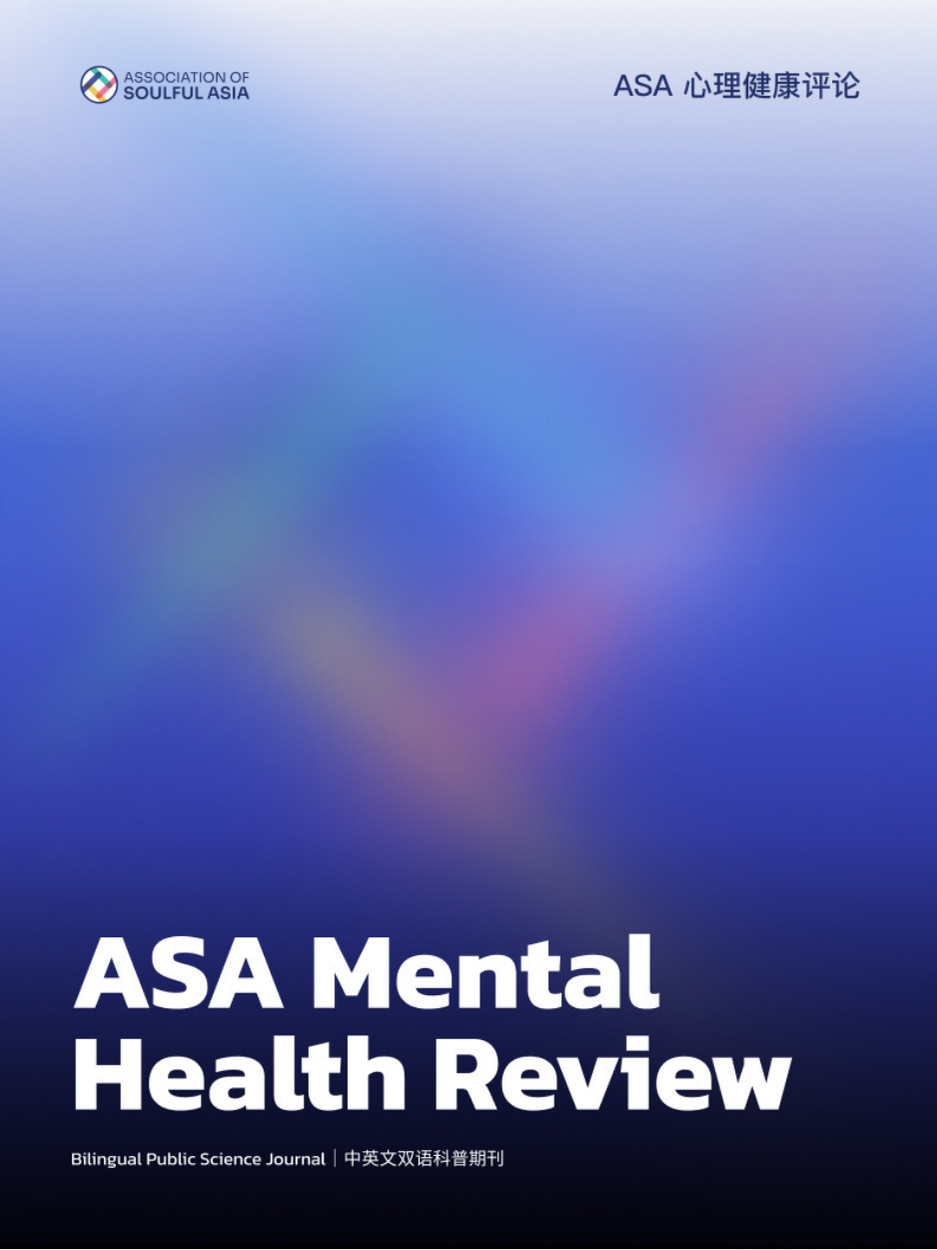
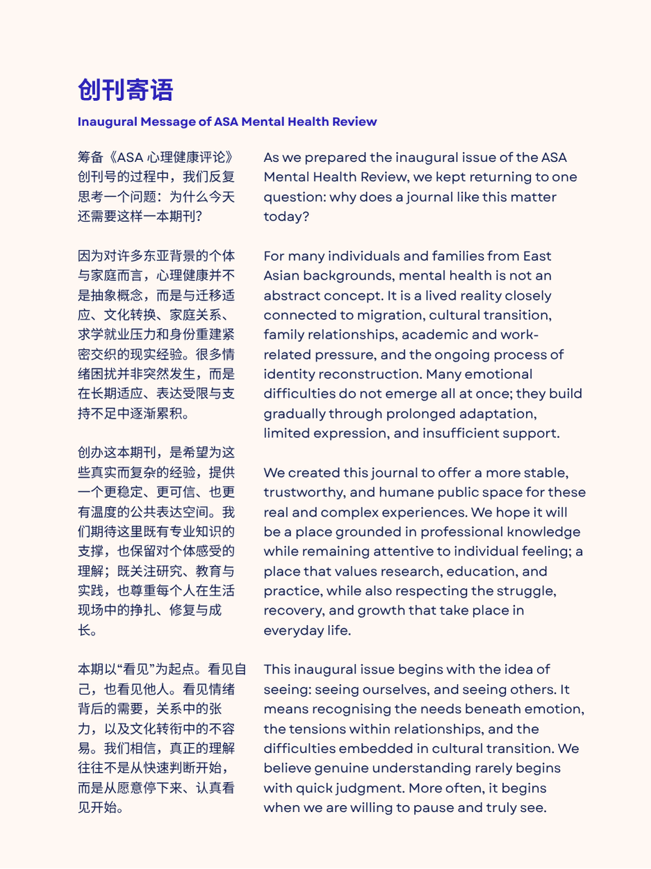
The ASA Mental Health Review is a bilingual public science journal covering mental health, cultural integration, healing, and community. I served as Editor-in-Chief and coordinated the full editorial and design operation.
Editorial team
Editor-in-Chief, managing editor, five section editors, four layout and design members, and a four-person advisory board.
Content and illustration
Articles in the healing column combine real personal narratives with original illustration work produced by the design team.
Failures and learning
This project also exposed where my first assumptions were too narrow. I initially thought in terms of building a better website, but the real challenge was product structure: account logic, membership levels, course access, operational workflows, and cross-surface data had to be designed intentionally much earlier.
I also learned that “AI-assisted delivery” does not reduce product responsibility. It actually raises the bar on judgment. I had to keep checking whether implementation still matched the platform logic I intended, especially when data flow, hosting, and system boundaries were not fully visible from the interface level.
The result was a deeper shift in how I work: I now treat platform boundary definition, infrastructure risk, and execution verification as part of product design, not as something to think about only after launch.
One concrete post-launch change came from volunteer feedback: the standards and verification pages were not surfaced early enough in the navigation flow. Users arriving from event promotions had no quick way to assess the organisation's legitimacy before deciding to join. I moved the standards and verification entry point higher in the site structure and added clearer trust signals to the homepage — a navigation fix driven by real user behaviour, not by aesthetic preference.
Systems thinking
How this project taught me to verify product logic even when the database and backend implementation were not fully visible.